LETTERS FROM TINA
CLIENT
Kristina Huynh (myself).
MY ROLE
Branding, logo design, web design, photography, copy writer, and social media.
PROJECT SUMMARY
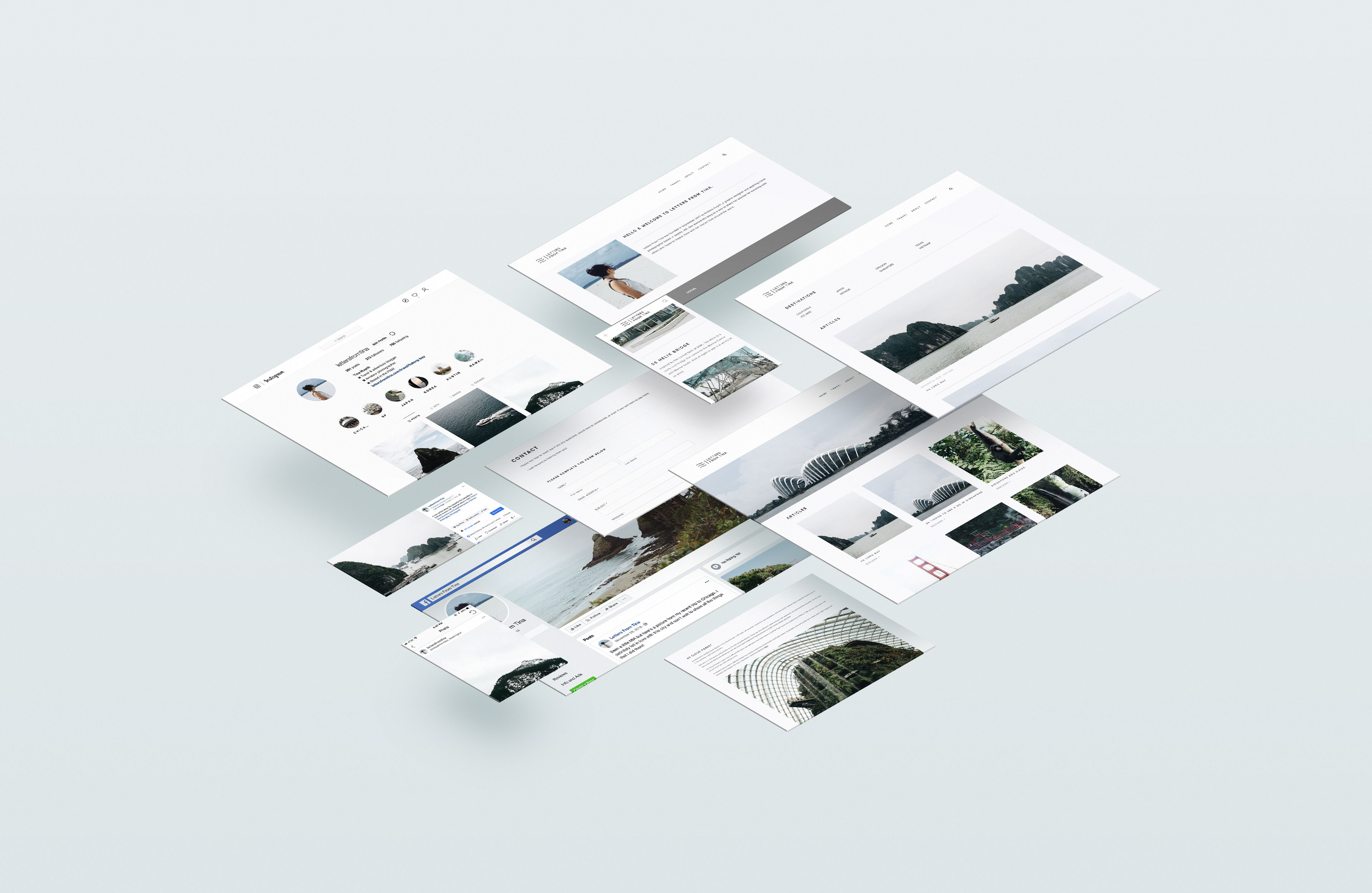
Letters From Tina was a travel blog that I created in 2017 as a passion project to not only document and share my travels but, also to push myself creatively in design and photography. I decided to stop blogging in 2020 for personal reasons but still enjoy adventuring and taking photos when I can. Below you can find my thought process behind the brand and what the website and social media platforms looked like.
BEHIND THE NAME
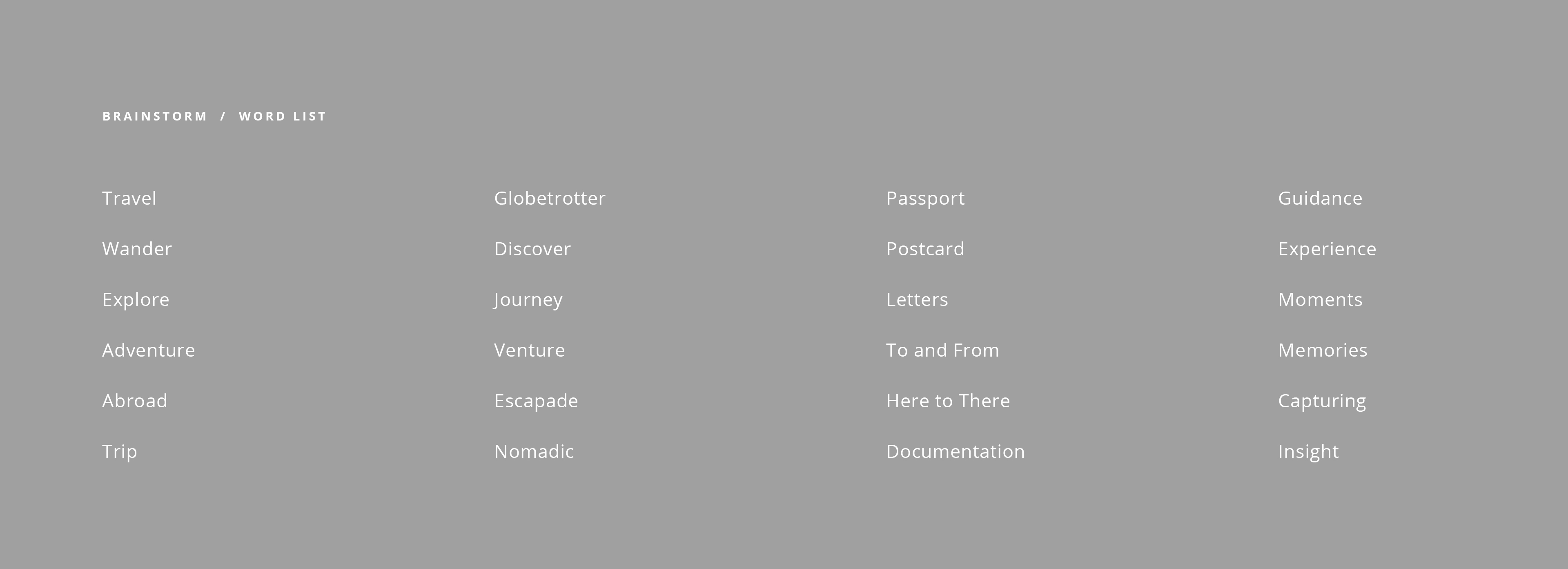
Coming up with the name "Letters From Tina" was definitely a process. I first had to brainstorm any and all travel related terms as well as variations of my name. I started thinking about how I wanted my audience to feel when they read my articles. That's when I thought of the lost art of writing letters. I decided on using "Tina" because that's what my close family and friends call me and thus Letters From Tina was born.
LOGO DESIGN
When I think of the word "letter," my brain goes old school to calligraphy and personalized wax stamp seals. My initial sketches were horrible attempts at something scripty. While I love beautiful hand-lettered logos, I know that it wouldn't represent the identity I was going for.
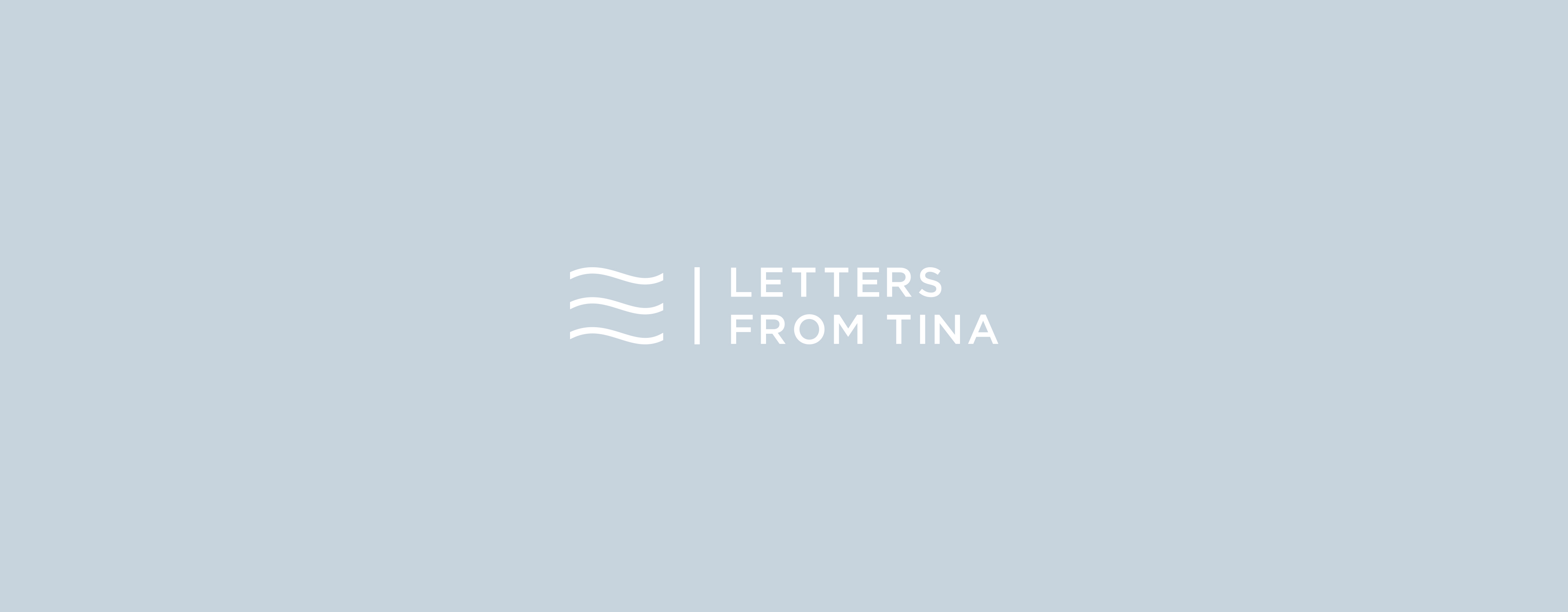
I started thinking about other components to letters and started to sketch variations of stamps. I wanted to keep things modern, clean, and minimal so I decided to go with the three wavy lines that verify if a letter has been paid for. This part of the logo represents authenticity. For the name, I decided to go with a bold, all-caps, sans-serif font.
BRANDING / IDENTITY
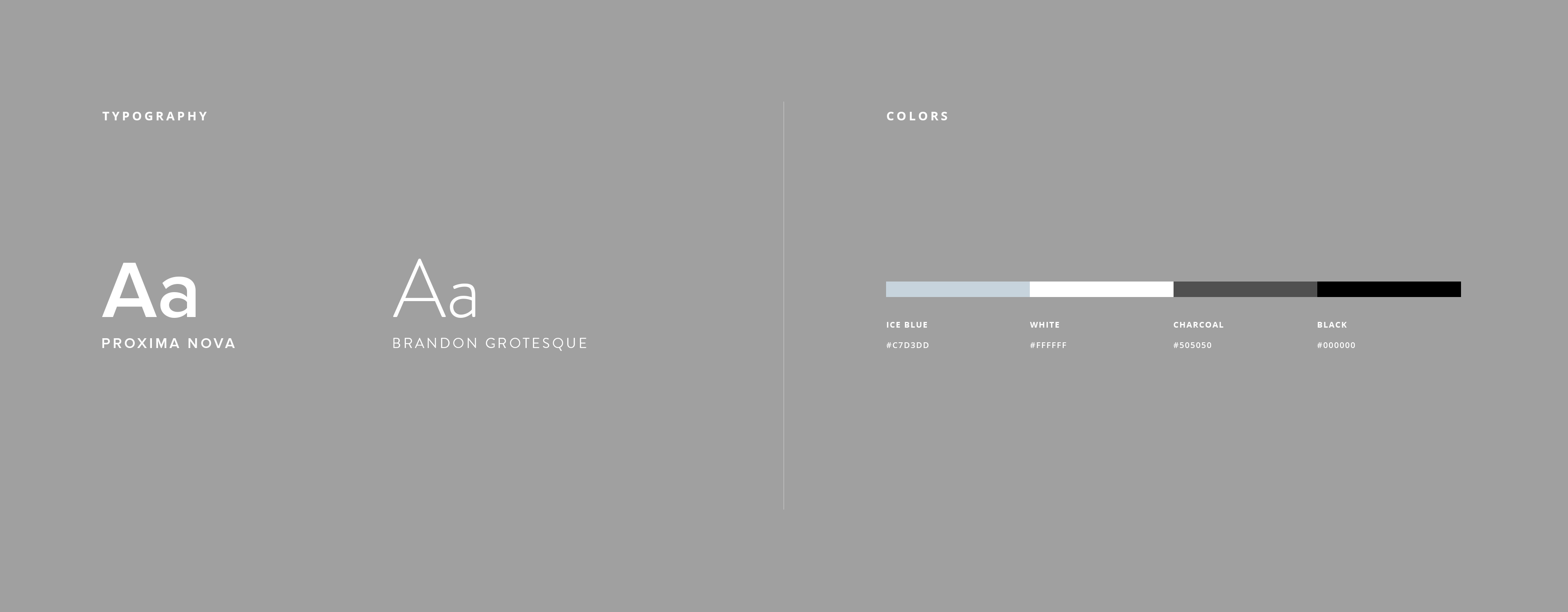
My vision for the Letters From Tina brand included leading with strong visuals and a clean, modern aesthetic. I chose to use sans-serif fonts and created a cool-toned color scheme that wouldn't distract from the photos.
PHOTOGRAPHY
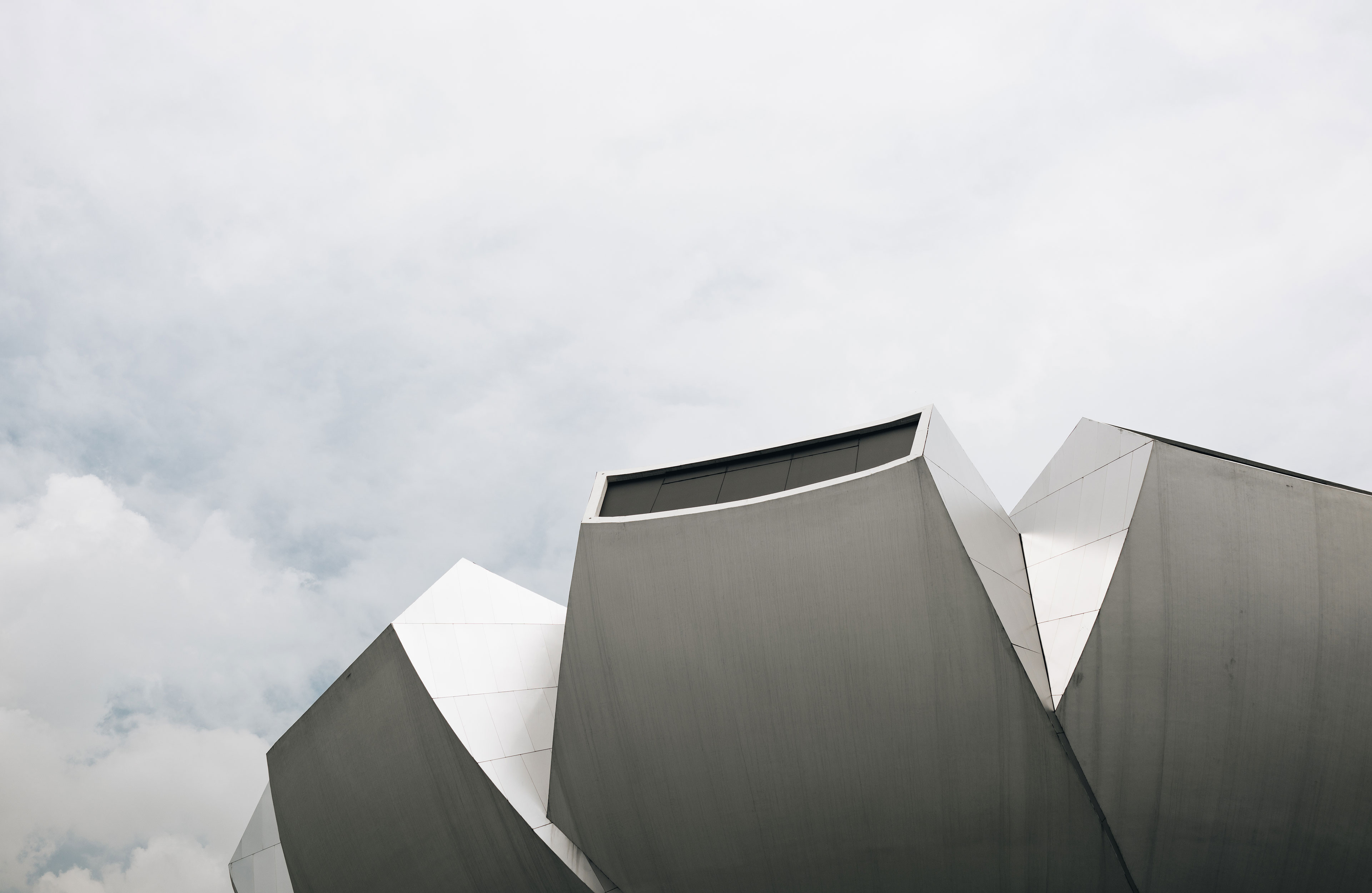
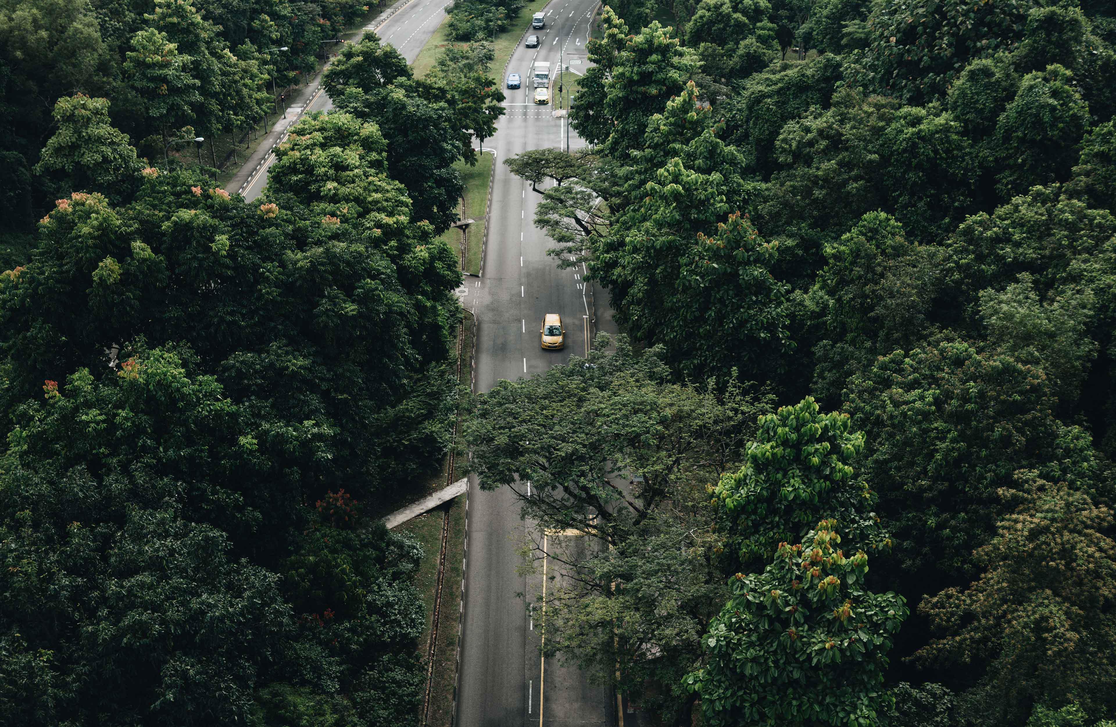
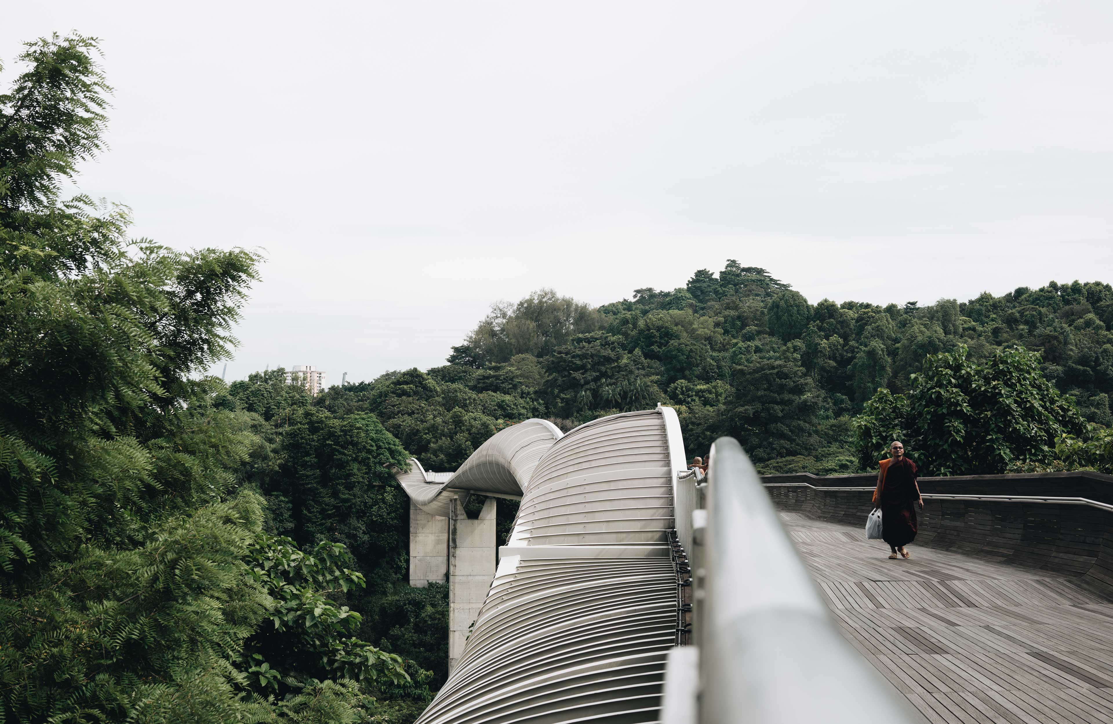
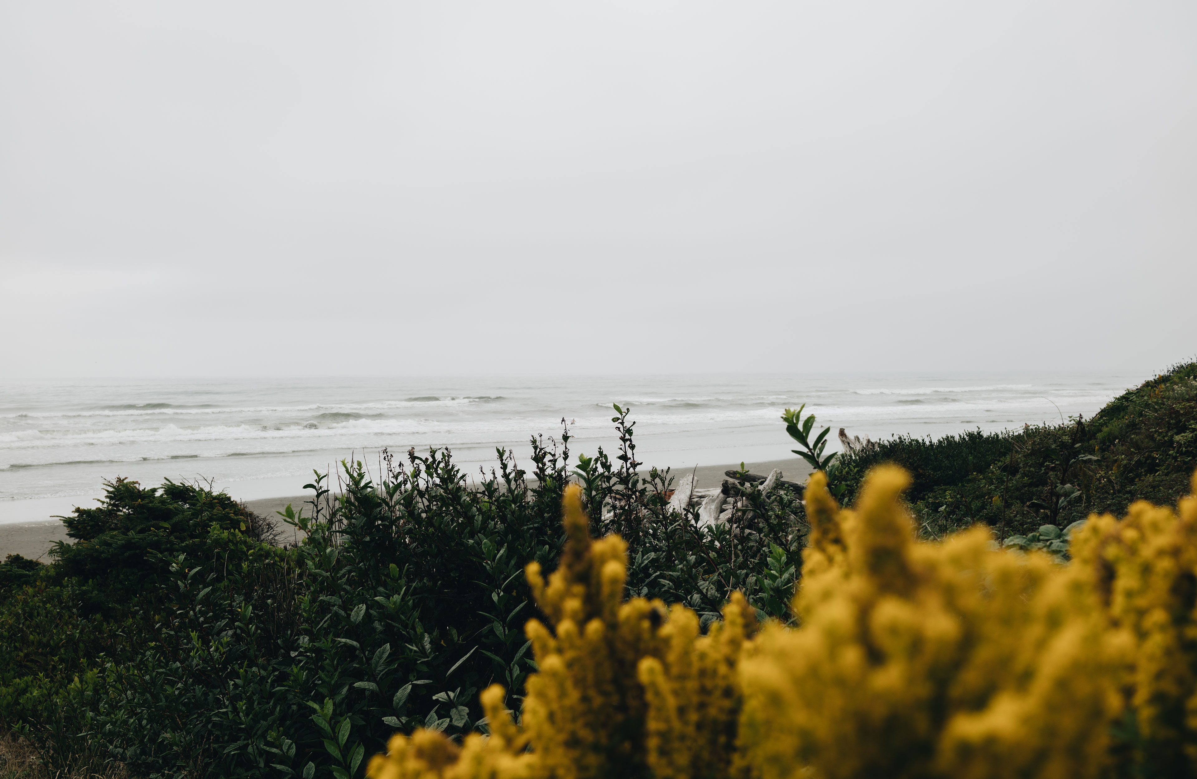
One of the goals I set for myself when I started this project was to get better at photography. Before launching Letters From Tina, I mostly took photos using my iPhone. Overtime (and with a lot of practice) I started getting more comfortable using a digital camera and started to establish my own photography and editing style. This style helped shaped the Letters From Tina identity.
One of the goals I set for myself when I started this project was to get better at photography. Before launching Letters From Tina, I mostly took photos using my iPhone. Overtime (and with a lot of practice) I started getting more comfortable using a digital camera and started to establish my own photography and editing style. This style has helped shaped the Letters From Tina identity.
WEB DESIGN
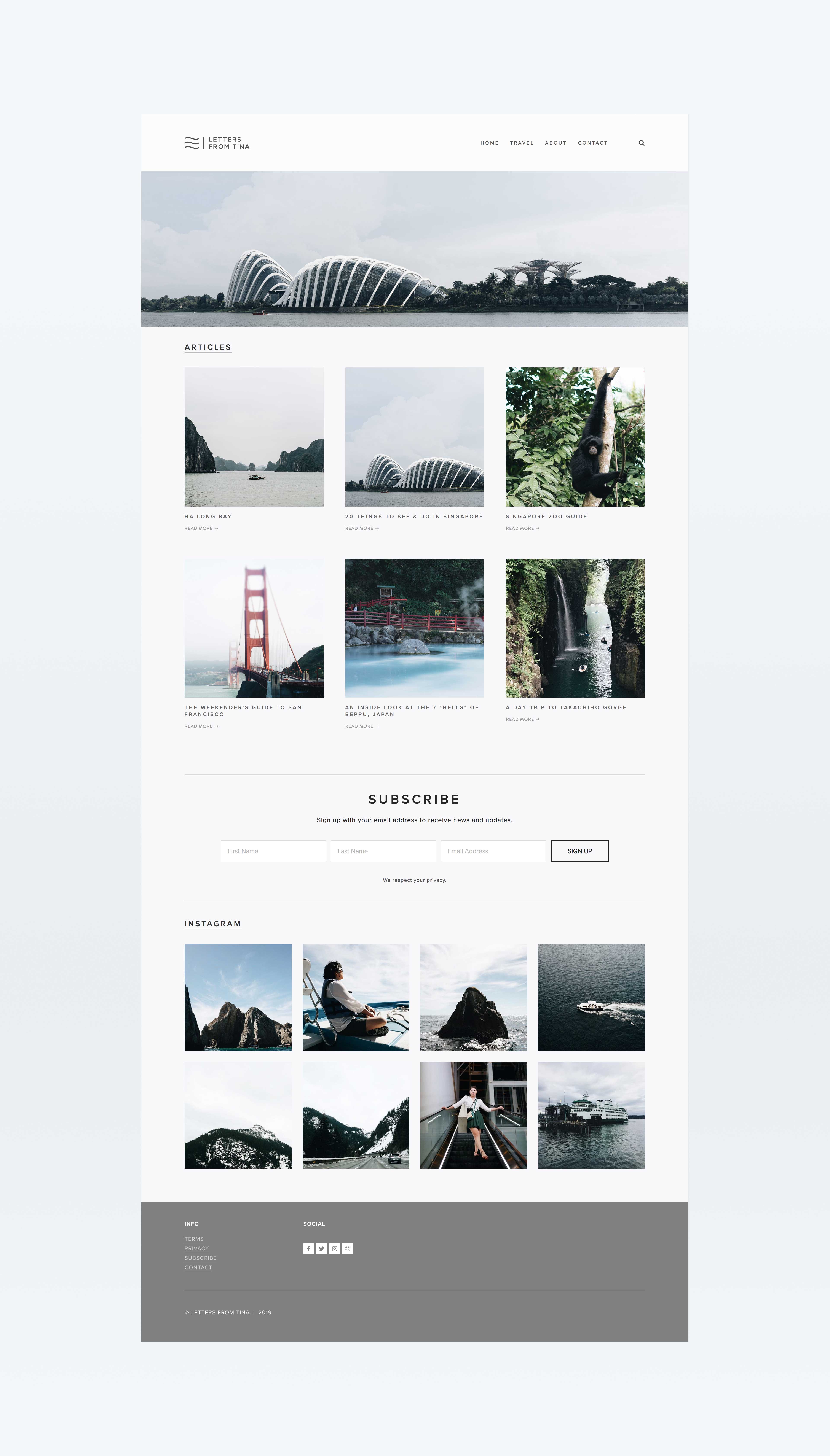
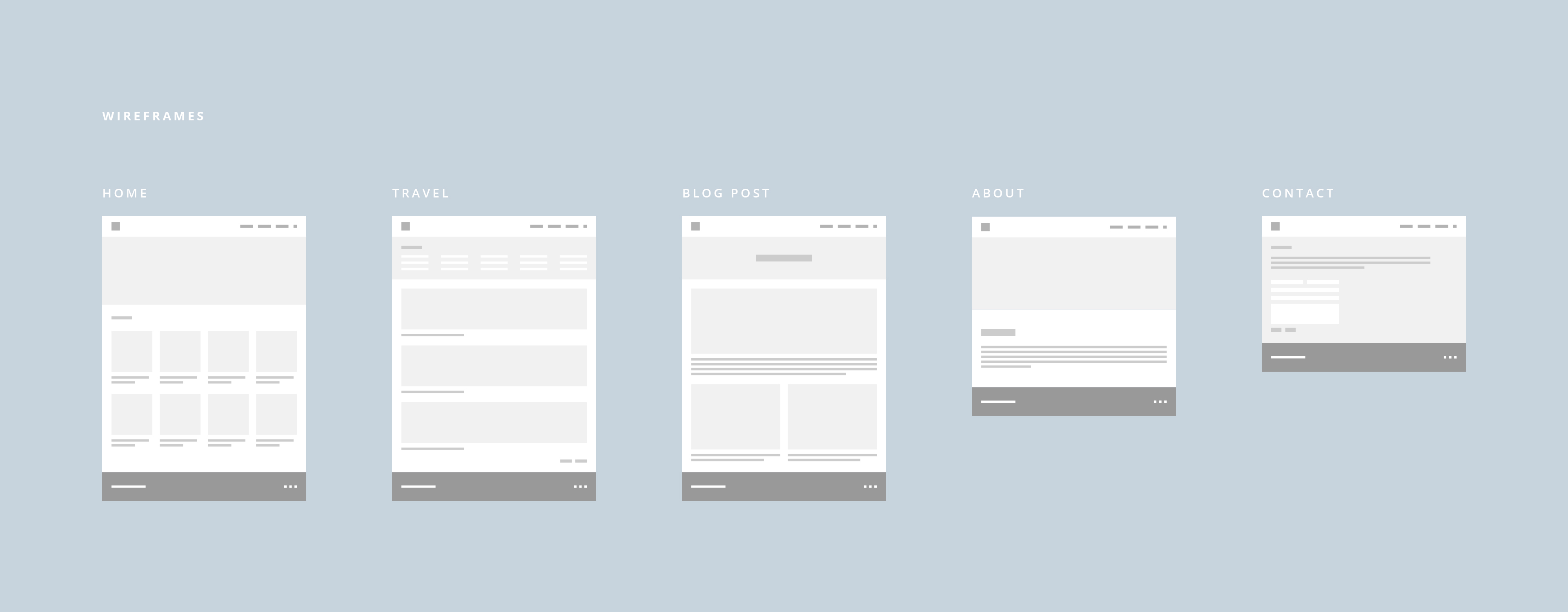
For the website, I decided to use photography as the driving force that would captivate my audience. Having used Squarespace before, I decided to use one of their templates as a starting point for the design and then injected some of my own code to get the styling right.